
Your dashboard distills thousands of Reddit conversations into a handful of numbers and charts. This guide walks through each one so you can read your dashboard at a glance and know exactly what it's telling you.
Every metric and chart below responds to the filters you have active (date range, keywords, topics, competitors, subreddits and more), so the same dashboard answers very different questions depending on the slice you choose.
The metrics bar
The row of tiles at the top is your at-a-glance summary of the current slice:

Conversations: total threads and comments matching your filters. The headline measure of how much your audience is talking.
Threads and Comments: the split between original posts and the replies they generated.
Authors: how many distinct people are behind those conversations, a quick read on whether a topic is broad or driven by a few voices.
Avg upvotes: the mean score of the matching content, a proxy for how much the community engaged with it.
Positive: the share of conversations with positive sentiment.
The small percentage next to each tile compares the current period with the one immediately before it, so you can see at a glance whether activity and sentiment are climbing or cooling.
Top Trends
Top Trends is your dashboard reading itself. Our AI analyzes every thread and comment in the current slice and surfaces the most important patterns as a short, ranked list, so you catch what's happening without scrolling through thousands of posts.
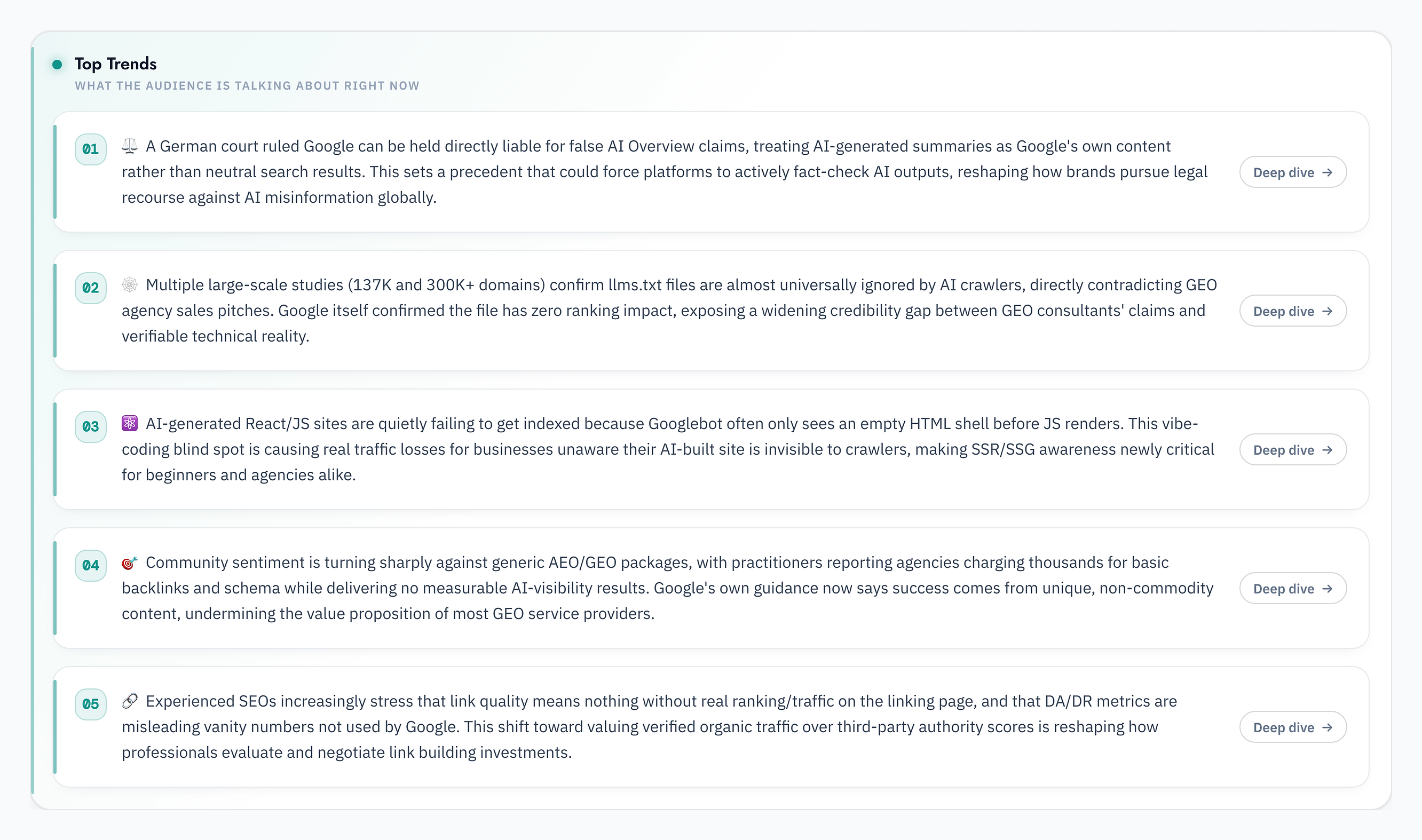
Each trend has a Deep dive button that opens the AI Analyst with a full breakdown: the story behind the trend, example discussions with links, and why it matters.
Sentiment at a glance
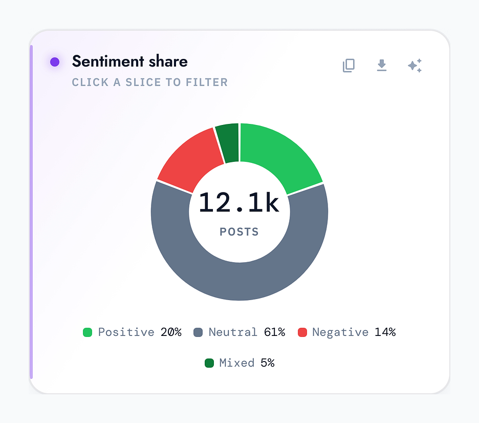
The Sentiment share donut shows how your audience feels about the filtered conversations: the balance of positive, neutral, negative and mixed posts, with the total in the center. Click any slice to filter the whole dashboard to just that mood.
Topics: what your audience talks about
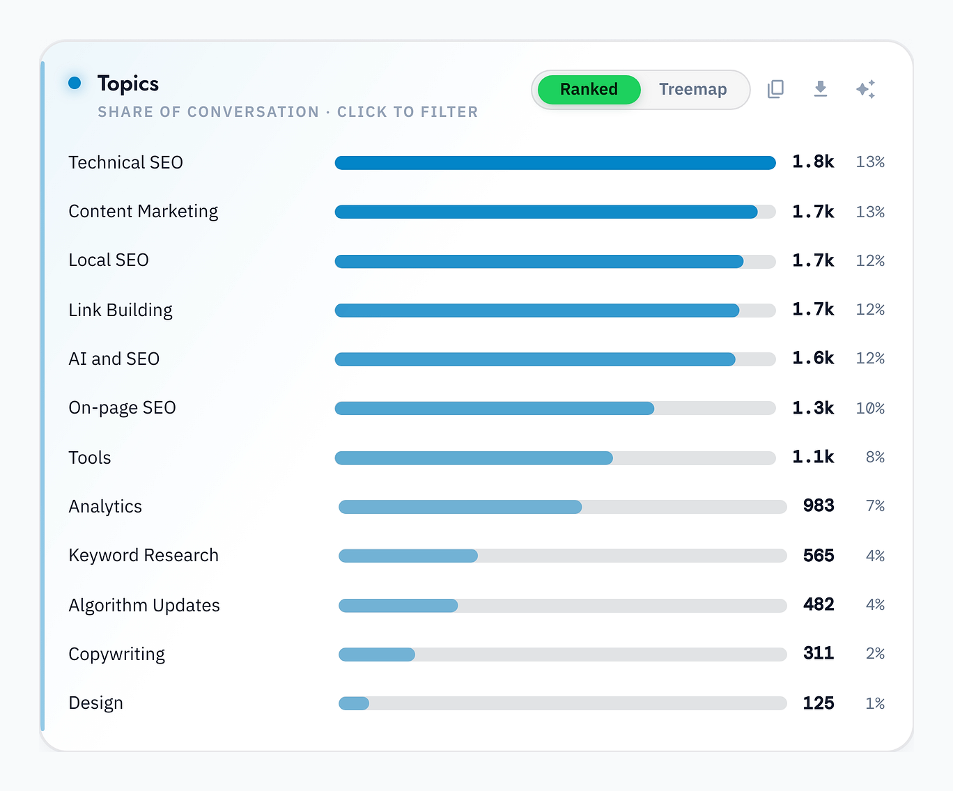
The Topics card ranks the subjects you defined during setup by share of conversation, so you can see what dominates your niche right now. Click a bar to filter everything else to that topic.
The language they use
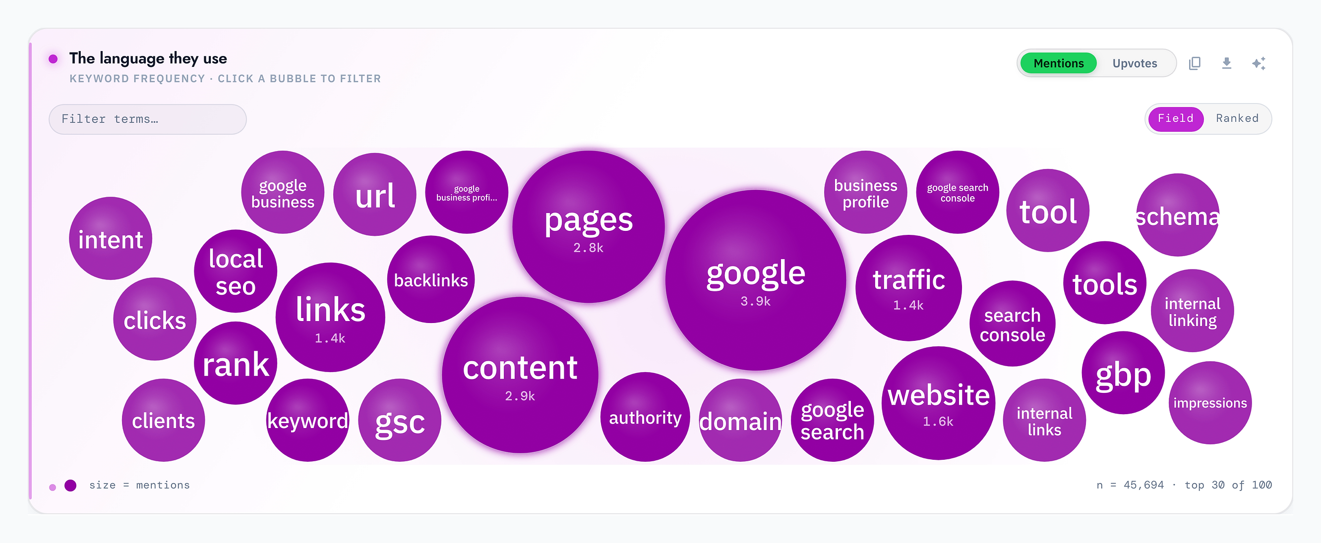
This word cloud captures the actual words and phrases your audience uses most. The bigger the bubble, the more often it comes up. It's the fastest way to pick up the vocabulary that resonates and work it into your own content.
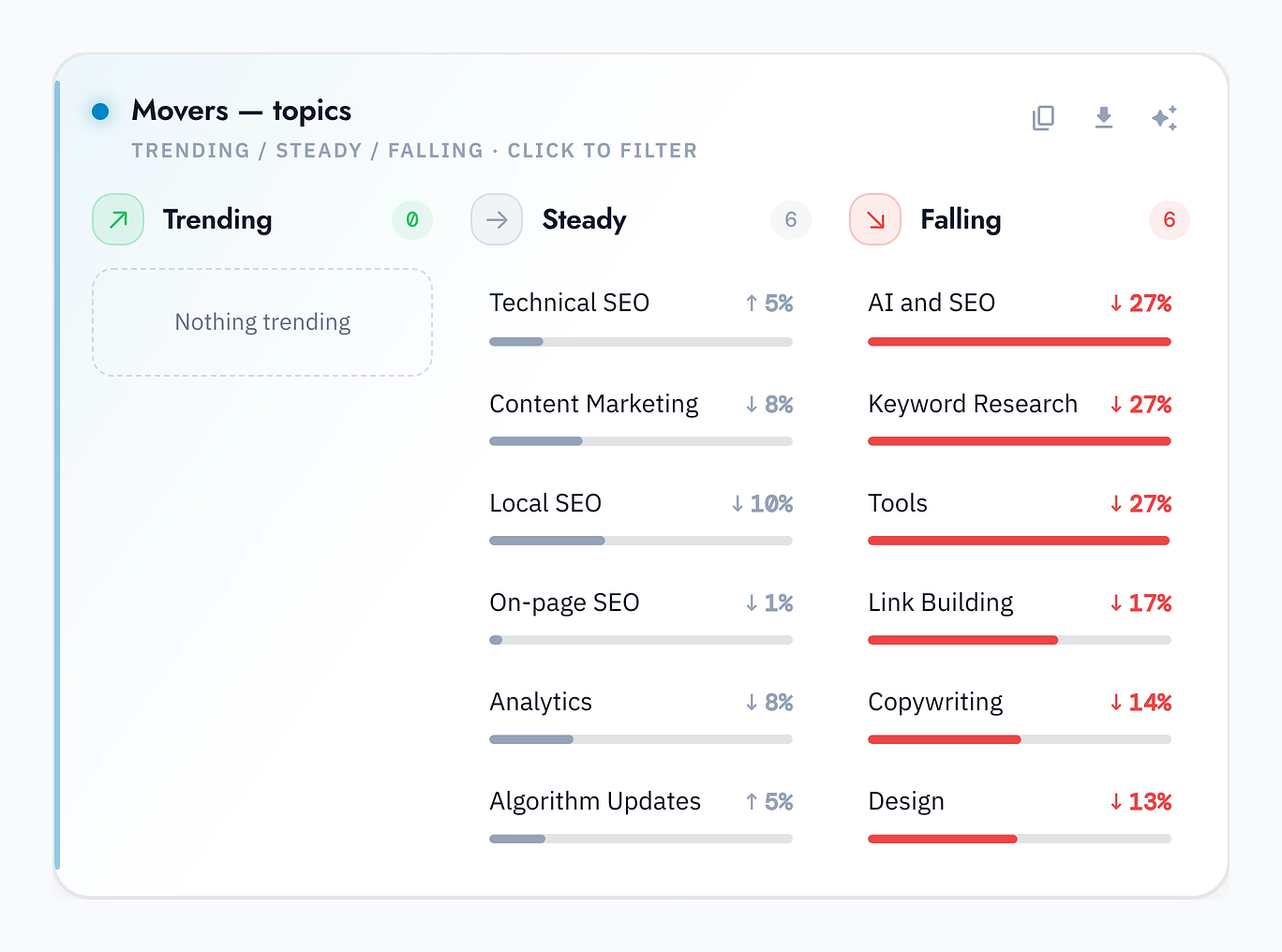
Movers: what's rising and falling
Movers compares this period with the last and sorts your topics (and competitors) into Trending, Steady and Falling, with the percentage change for each. It's your early warning system for shifts in what your audience cares about.
Everything is filterable, and you can just ask
Remember that every number and chart reflects your active filters, so you can answer very specific questions by stacking them. And whenever you'd rather ask in plain English, the AI Analyst analyzes the exact slice you're looking at.
For a full walkthrough of setup, data gathering and every dashboard feature, see How Crowd Intelligence Works: A Complete Guide.